Free Accessibility Tools
Colour Contrast Checker
Use our free Colour contrast checker to make sure the scheme youre using is accessible
Your Contrast Results
Your colors meet WCAG requirements
21:1
Enter your text color and background color above to see if your color combination is accessible and compliant for those with visual impairments.
Your Compliance
Small Text
WCAG AA:
Pass
WCAG AAA:
Pass
Large Text
WCAG AA:
Pass
WCAG AAA:
Pass
Graphics & UI Components
WCAG AA:
Pass
Preview
This text is considered "large text"
This text is considered “small text”
This icon is considered a “graphic”
This text input field is considered a "user interface (UI)" component
Contrast Ratio Scale
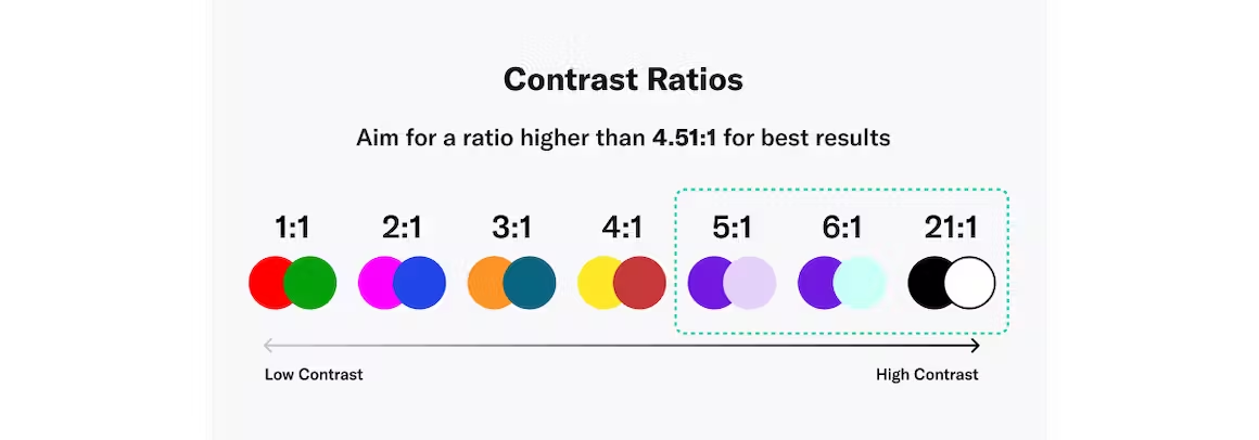
Contrast ratio refers to how bright or dark colors appear on screens. The more scientific definition is that contrast is a ratio of the luminance of the brightest color to the darkest color that the system can produce. Contrast ratios range from 1 to 21 (written as 1:1 and 21:1). The first number, L1, refers to the relative luminance of light colors while L2 is the second number that refers to the relative luminance of dark colors.
How Does a Color Contrast Checker Work?
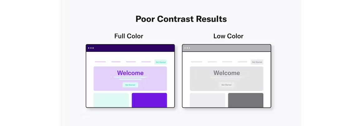
Color contrast — which is the difference in color between two elements — influences how well users read and navigate a website.
For users with visual impairments, including low vision, cataracts, or color blindness, color contrast significantly influences their experience. The lower the contrast, the more difficult it can be for these individuals to navigate a page.
A color contrast checker ensures web pages are accessible by determining whether they meet WCAG color contrast requirements.
Understanding Contrast Ratios
WCAG has two levels of contrast ratios :
- Level AA: The minimum contrast level is 4.5:1.
- Level AAA:Enhanced contrast has a ratio of 7:1.
It’s recommended organizations provide higher-contrast text and images where possible; however, Level AA is the required standard for accessibility.
Here’s the bottom line: the more contrast you have between your text and UI elements and background colors, the more accessible it is for everyone.
Try our tool below to test colors' contrast.
Tips on Using Accessible Colors and Color Contrast on Your Website
Choose the Right Color Scheme
A color scheme is a combination of hues that are implemented in specific design contexts, such as a site’s layout. Color plays an important role in making your content accessible to people with visual impairments. Web color accessibility in design considers your audience and any condition or disability they may have in perceiving pigmentation.
When it comes to creating an accessible website, color choice matters. Including accessible hues in your design palette will make your site more usable to people who may have vision impairment or low vision.
The Web Content Accessibility Guidelines (WCAG) outline various recommendations for color accessibility, including guidance for color contrast ratios, luminance, backgrounds, and color spacing in order to make a site more accessible to those with any type of vision deficiency. The following aspects of website color schemes can help you design with accessibility in mind.
Aim For a Contrast Ratio of 4.5:1 or Higher
A color contrast ratio determines how bright or dark colors appear on a screen. They can range from 1 to 21 (written as 1:1 and 21:1, respectively). The first number in the ratio indicates the relative luminance (or brightness) of the light colors, and the second represents the relative luminance of dark colors. WCAG recommends using 4.5:1 as the minimum ratio for text and interactive elements.
Audit your website for FREE
Find out now if your website is WCAG & ADA compliant